Rocket Coffee
What we did
Brand Refresh
Packaging
Signage
Visual Communications
Rocket Coffee are the OGs of the Kirikiriroa coffee scene kicking off in the mid 90s and growing a solid national distribution from day dot. With a penchant for fixies and vintage road bikes; and with a decent percentage of the crew coming from the Tron’s best indie bands, the brand refresh needed to reflect team Rocket’s attitude, high propulsion product suite and ecological-mindedness.
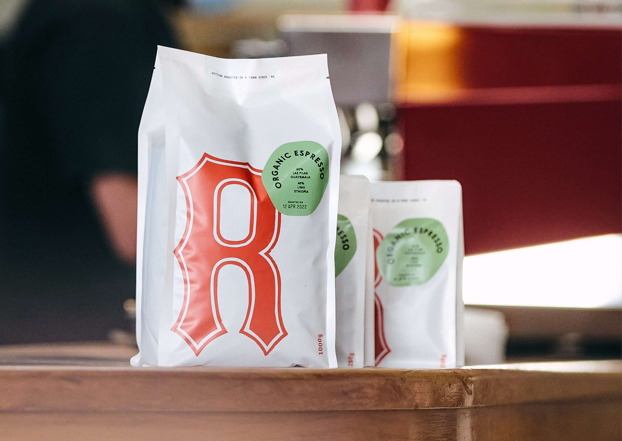
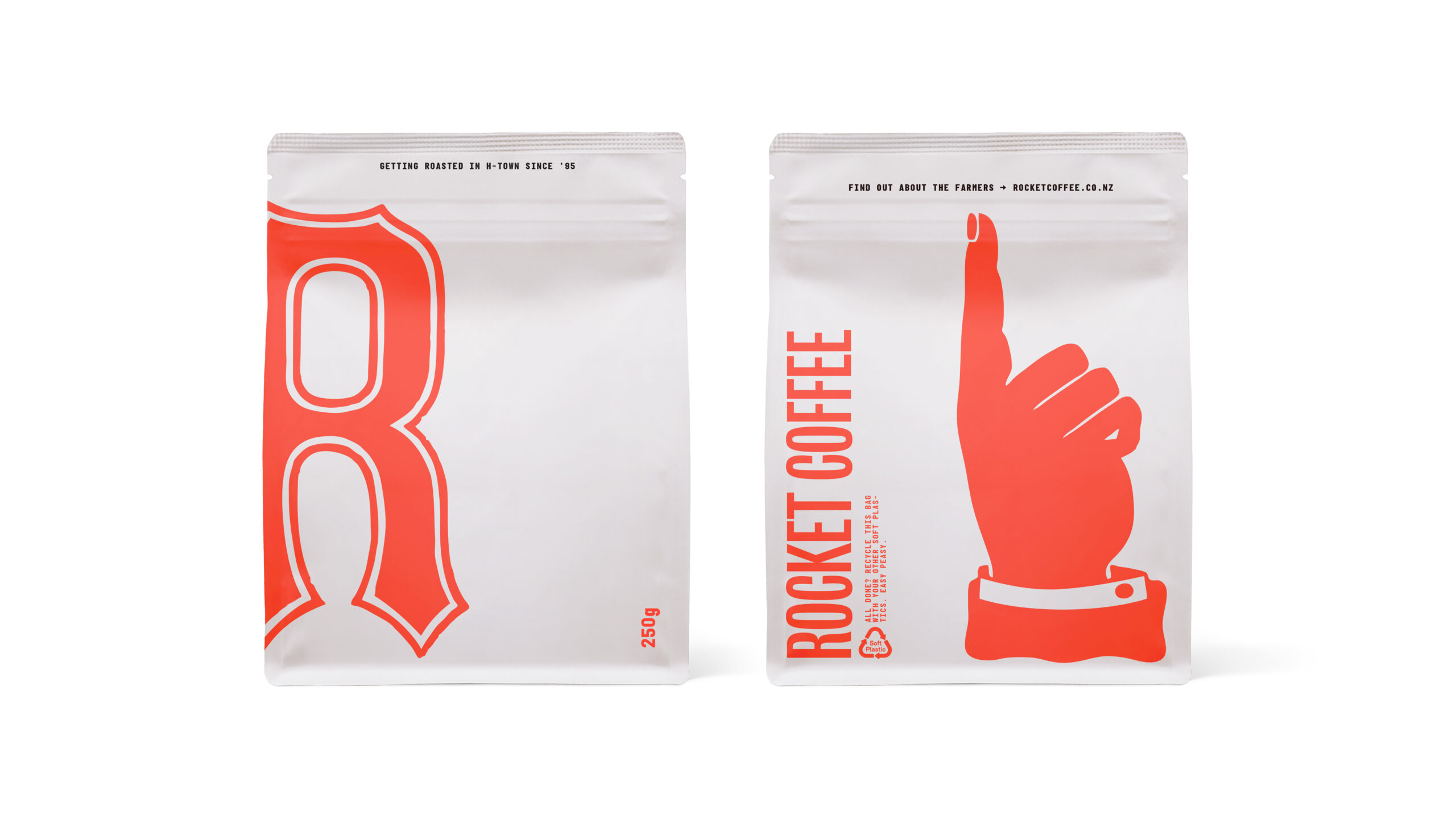
Rocket came with a strong brand equity, ‘nice assets’ as we called them, being well established over the last 3 decades. The original marque and pointing hand were derived from vintage woodblocks purchased by one of the owners back in the day. We took them as given and turned our attention to the typographic system and palette, introducing a striking hit of hot red to lift the marque from its former darker tones and typography that continued the cranky DIY legacy with a touch of panache.
The move in packaging from non-compostable lined uncoated paper bags to recyclable soft plastic gave us a clean base for the brand to pop off. We coupled this with a new sticker system for standard and specialty blends. The bean-esque shaped stickers being flexible in application (there is no such thing as a bad placement) was a relief for the OCD-afflicted within the team. The sticker colourways differentiate the variants and growers, inspired by the vintage world map hanging in H-towns best roastery.